Neutral tones are often described as safe or simple, yet their emotional influence is far from plain. Warm neutrals carry subtle depth that affects how a space feels, how long it stays appealing, and how easily people relax within it.
When used thoughtfully, these tones create calm, balance, and quiet confidence without asking for attention. This guide explores the hidden power of warm neutrals and shows how you can use them to build spaces that feel inviting, flexible, and emotionally steady.
Why Warm Neutrals Feel Different
You may notice that some neutral rooms feel cold, while others feel soft and welcoming. The difference lies in undertone and balance. Warm neutrals quietly support emotional comfort by working with light, texture, and daily habits.
Undertones that support ease
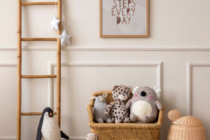
Warm neutrals often carry hints of beige, clay, or soft stone. These undertones reflect light gently rather than sharply. You experience a sense of ease because the room avoids harsh contrast. The space feels settled, even during changing daylight. This stability helps rooms feel consistent from morning to evening.
Visual rest without dullness
Bright colors demand attention, while stark neutrals can feel flat. Warm neutrals sit between these extremes. They allow your eyes to rest without losing interest. You may feel calmer because the space does not compete for focus. This makes warm neutrals especially effective in shared living areas where balance matters.
Emotional warmth through familiarity
Many warm neutrals echo natural surfaces such as sand, linen, or clay. These tones feel familiar on an instinctive level. You respond emotionally because the colors connect to everyday surroundings. This familiarity creates comfort without needing bold statements.
Using Warm Neutrals With Intention
Warm neutrals work best when treated as a system rather than a single choice. You shape mood by how these tones interact with texture, light, and proportion.
Layering similar tones for depth
Instead of relying on one neutral shade, you can layer several close tones. Walls, seating, and soft furnishings can each carry slight variation. You notice depth without clear contrast. This layering makes the room feel rich while remaining calm. The space feels designed rather than empty.
Letting texture do the speaking
Warm neutrals pair naturally with textured surfaces. Woven fabrics, matte finishes, and subtle grain patterns add interest without breaking harmony. You feel warmth because texture adds softness to the palette. The room becomes inviting without relying on decorative excess.
Supporting flexibility over time
Warm neutrals adapt easily as tastes change. You can introduce seasonal accents or rearrange furnishings without disrupting balance. This flexibility reduces visual stress. You feel comfortable making changes because the base remains supportive rather than restrictive.
The hidden power of warm neutrals lies in their ability to create comfort quietly and consistently. They shape emotional warmth through gentle undertones, visual rest, and natural familiarity. When layered thoughtfully and paired with texture, warm neutrals turn simple spaces into welcoming environments that age gracefully. By choosing warmth over starkness, you create rooms that feel calm, balanced, and easy to live with every day.